Robin Williams (the designer and Shakespeare aficionado – not the comedian) has written two books on graphic design. The books are full of tips and insights that will take your presentation visuals to the next level. She created The Non-Designer’s Presentation Book for people who create their own presentation visuals (slides). It walks you through creating slides using professional design concepts. I highly recommend it.
Her other book is the Non Designer Design Book. This book is for people who need to design professional looking documents. It’s targeted at people who have no background or formal training in graphic design. People who from time to time need to put together things like newsletters and pamphlets. It’s for anyone who understands that an attractive document gets more attention.
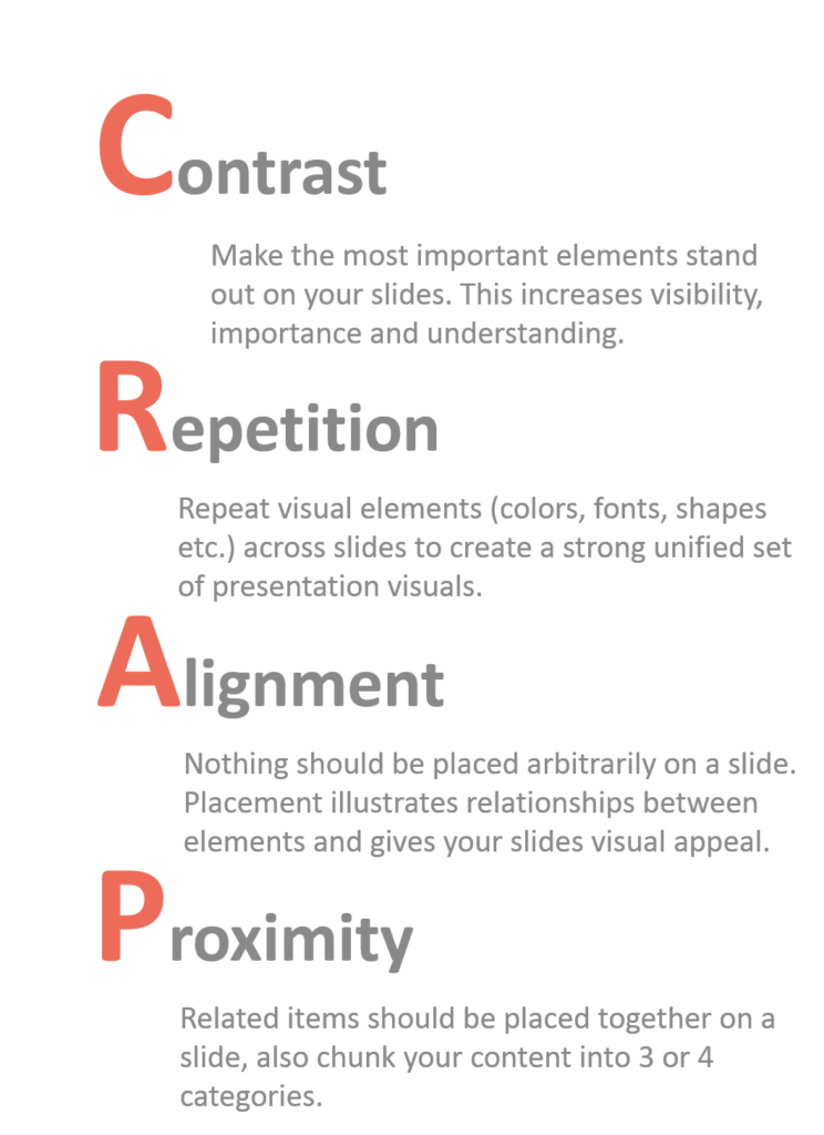
In this book she introduces the basic design concepts that spell the rather interesting acronym CRAP. The acronym stands for contrast, repetition, alignment and proximity. I believe that your slides need to have CRAP. These design concepts generally used in documents also work for slides.
Check out either or both of her books. The tips and knowledge will help you create much more impactful presentation visuals.
Joe Pops
R2BB

